

This week I would like to cover a personal topic and something that I don’t think enough people pay attention to in their design work. The use of color in reporting. I, like 8% of all men and 4.5% of all women, am color blind. Deuteranomaly specifically.
Story Time! I was once asked to create a report for a client. They specified the colors they wanted in the vague color names. I selected several colors that I through looked good. The client, who is one of the nicest people I have ever worked with, called and sounded really nervous.
Client – The colors your picked, they are… um… interesting.
Me – Yeah?
Client – I don’t know how to ask this, are you color blind?
Me – Yup, my whole life. To me a 24 pack of crayons has about 8 unique colors in it.
Client – Oh Good! These colors are awful. They actually cause nausea. They have to be the worst colors anyone could have selected.
Me – I said I was color blind, not that I didn’t have feelings.
When I develop user interfaces, I rely on approved color selections and get color requests in color codes. Pantone names, Hex Code, RGB values, they are all good. Sites like Coolors provide color palettes that are safe and friendly.
All these tools make it easy for someone with a color vision issue to create a good-looking interface. Now, you color seeing people, we need to talk.
First off, lets get into groups.
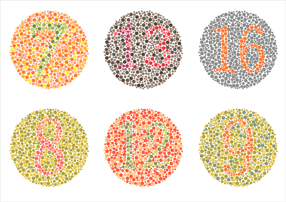
If you can see the 16 in the upper right corner, but a few of the other circles are giving you trouble, then you may have color vision issues. Welcome to the club! If you can read all the other numbers, then here are some tools and techniques to help you support your color-blind colleagues.
- Use color blind friendly palettes.
Most sites that offer palette samples, like coolers.co, include color blind simulations and palettes specific to color blind inclusion.
2. If you have to use red and green colors together, leverage light and dark colors to provide contrast.
3. Find a color blindness simulator.
My favorite is DevToys. I share it with everyone on my team and ask that they run samples through it to ensure that everything looks good.
Here is an example report that should be a crime.
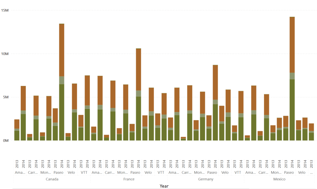
I can plug it into the Color Blindness Simulator and simulate what it will look like for all three common color blindness’s.
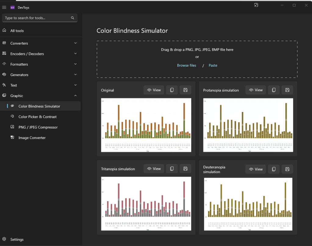
This is specifically what I see.
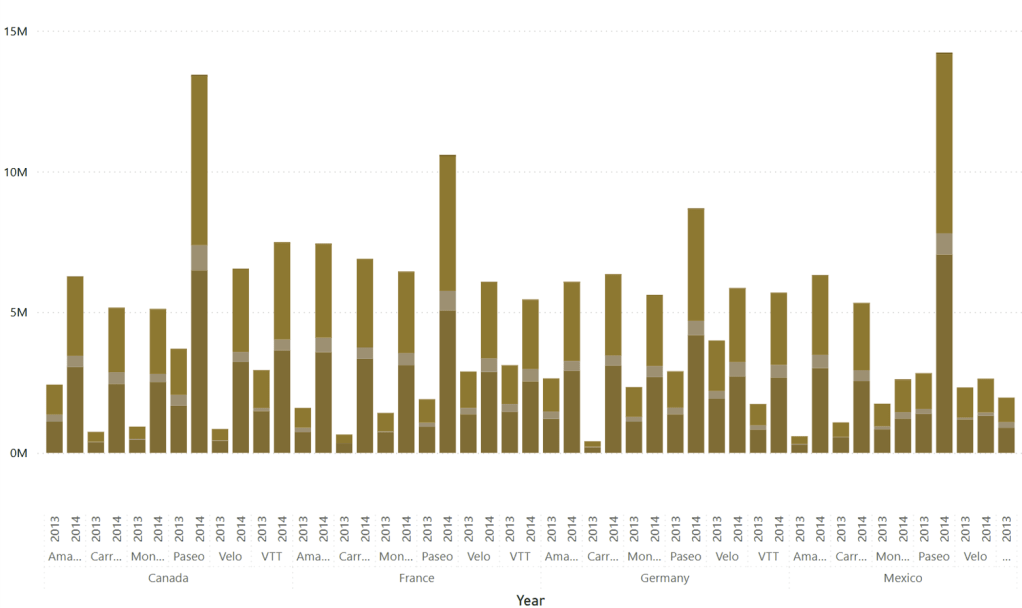
This is an extreme example. However, just packing greens, oranges, browns, and reds of similar brightness together can make it difficult for many people to read.
This is a rather short post this week. I’m getting ready for Directions NA 2025.

Thanks for reading, and I hope this helps you make your reports more inclusive and easier for everyone to see.


Leave a reply to Step-by-Step Guide to Word Reports in Business Central – Aardvark Labs Cancel reply